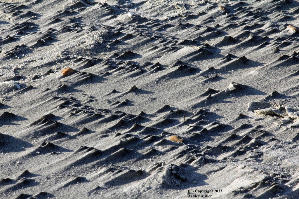
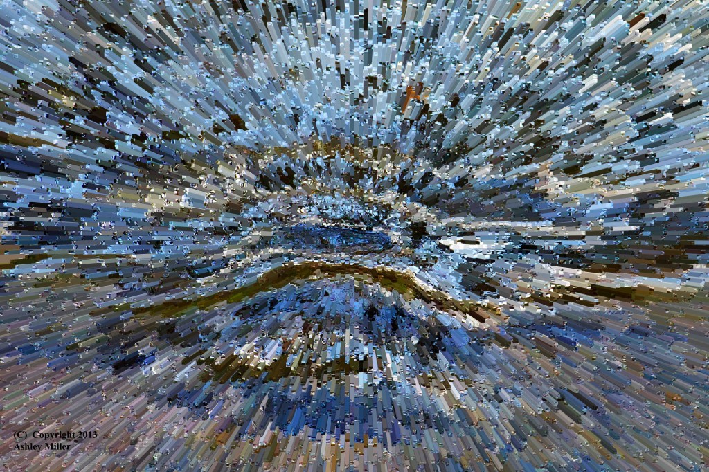
Still pointing the camera down and looking for small detail I took this photograph. Other than a bit of tweaking I did not do much in photoshop. So what is it? Well it was a windy day at the beach and the wind had picked out small irregularities in the sand and created a mini-dune system; no more than a centimetre high and a couple of centimetres long. The next tide will have obliterated it; proving that you cannot always go back to a location and take the picture you knew afterwards that you should have taken, you need to use your eyes and brain and see the opportunities that are there; well that and a digital camera with a large memory card helps … I took lots, slightly different angles, slightly different exposures and slightly different framing. All (!!) I have to do now is review those dozens of photographs of this subject; sometimes there has to be a downside to digital.
Think small
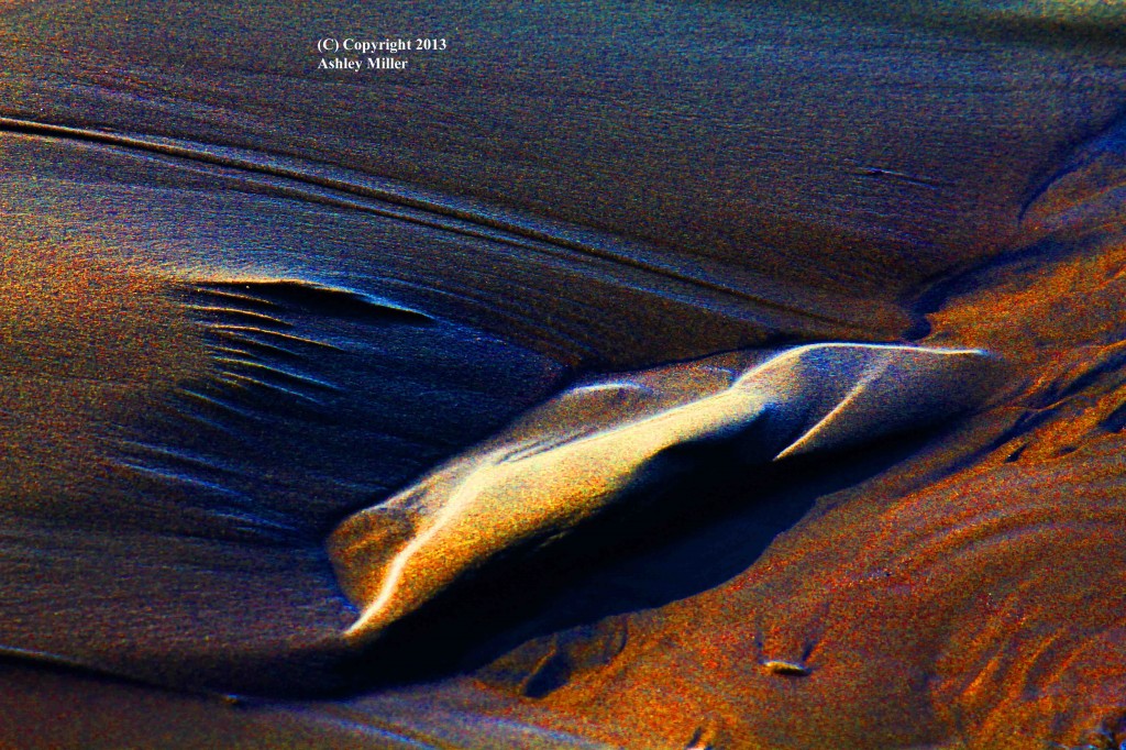
Now I do love the big landscapes and admire the images of them. And I have taken quite a few myself. Yet I also find fascination in the small details; so whilst other photographers are pointing their cameras up and bolting on the wide angle lenses I often find myself pointing the camera down and bolting on the telephoto. Each to his own and it pays to try something different. This image started as a small detail left in the sand by the retreating tide. I then pushed the colours just to see what would happen. Interesting.
No it’s not
Alien
I’m back
After my foray into the world of studio shoots … I’m back
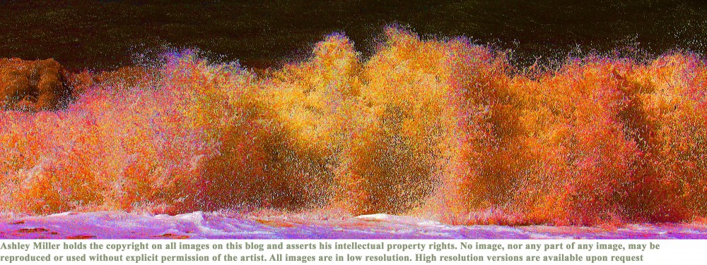
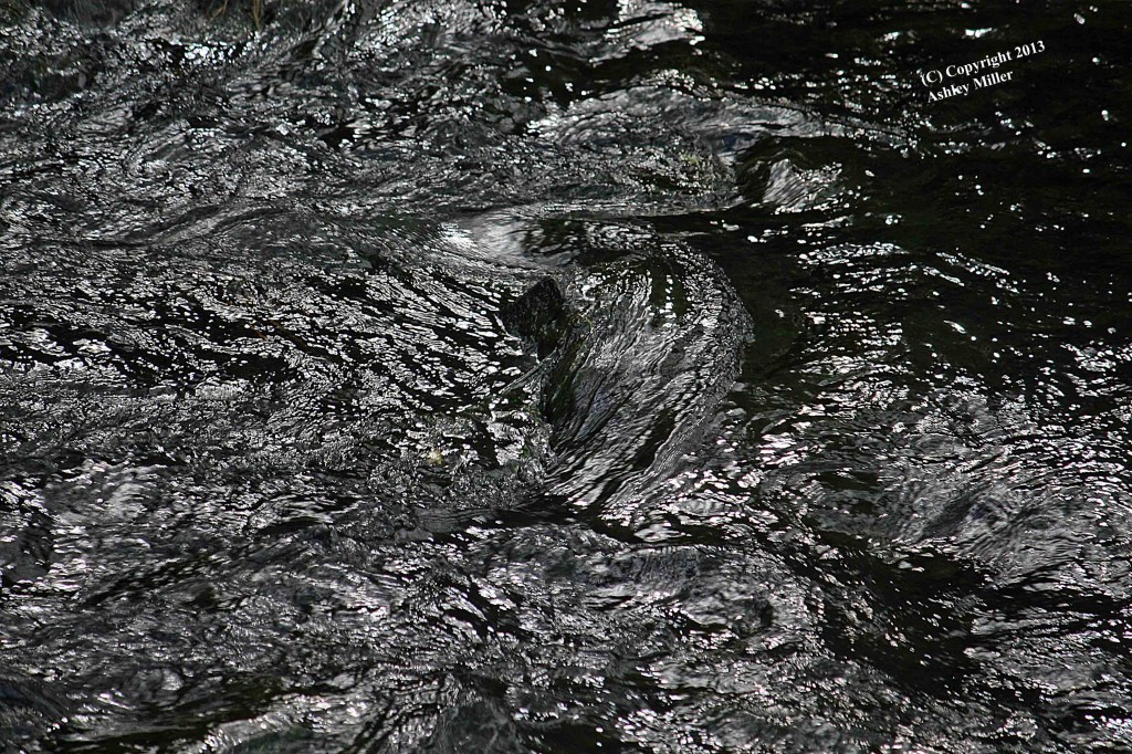
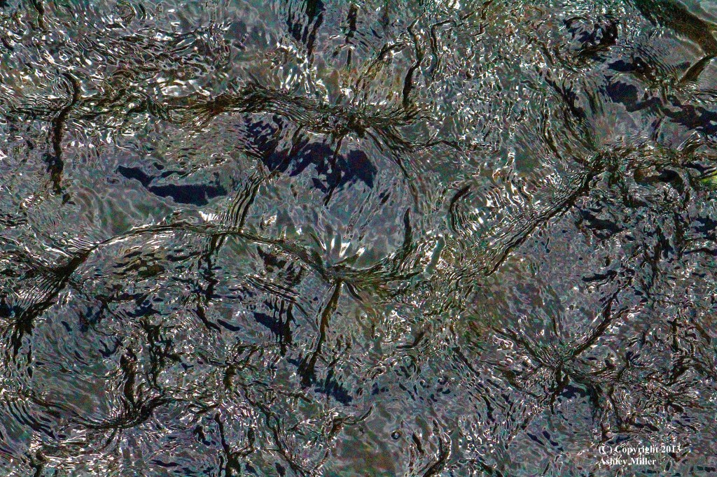
This image started as a photo taken at the south end of Rydal Water in Cumbria. I cropped it tightly so as to give the eye/brain minimal information as to what was rock and what was water, just reducing it to pattern and texture. I then pushed the colours hard in photoshop (but not to extreme, it caused them to break up messily) as the original was almost pure black & white, and pleasing in its own right, yet …. this is the result, which also pleases me. If anyone wants to see the B&W version then just write a comment.
And finally (for now)
Well this ‘theme’ started by accident and then continued to show I did more than landscapes. Yet it is not so very different. The textures and patterns of nature appear in many forms, in this case a couple of pretty models, and still showing the many variations available to challenge the photographer. This was a first for me; the results are interesting if far from perfect; so a new challenge.
There is no pleasing some people
So after the photo shoot one of the models asked the photographers if they could send her a selection of photos for her portfolio. So I sent a small collection of which this is one.
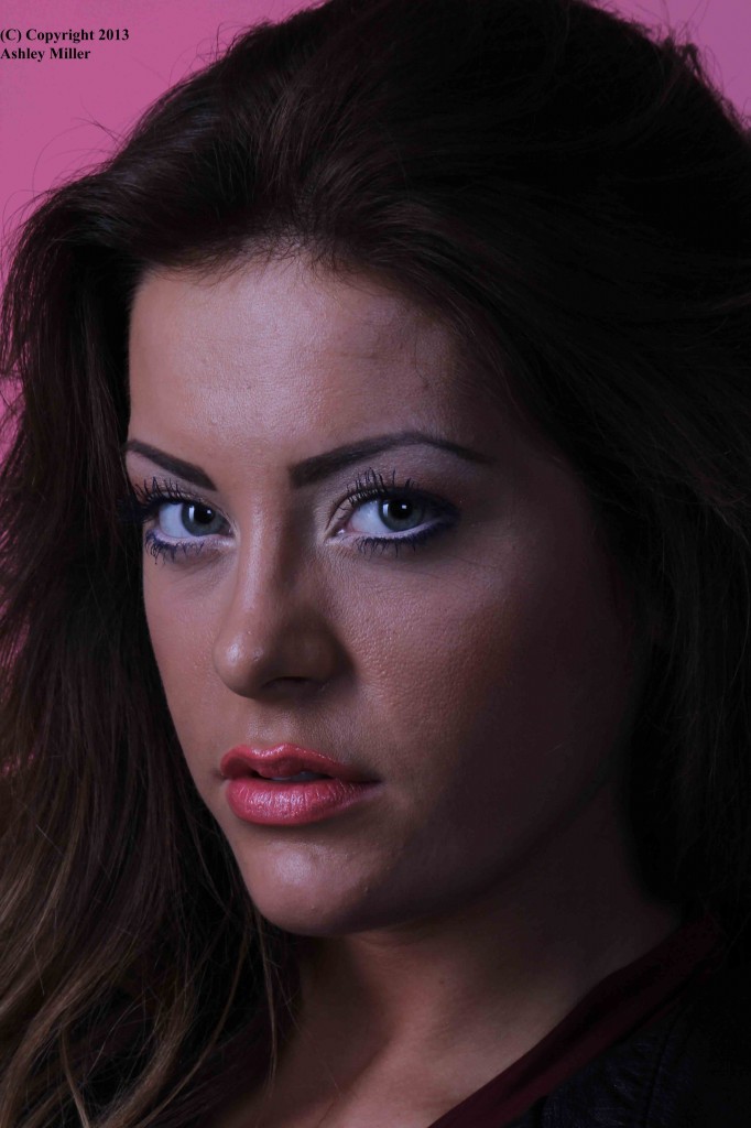
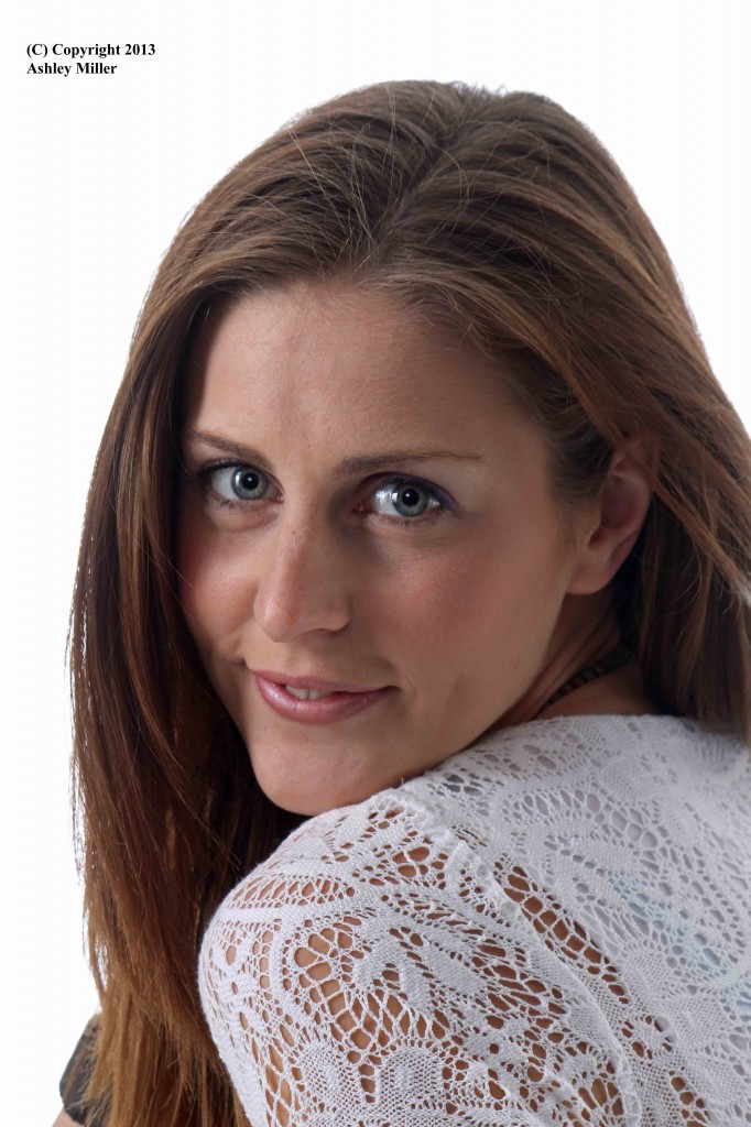 Now I like this photo; it shows a pretty and happy girl, which I thought she was. And she wrote a quite surly email back saying how it made her look tired and haggard (apparently she complained to other photographers that I spoke to about their photos). But she said she really liked this one
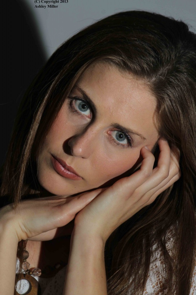
Which I think makes her look solemn and tiredt; I just put it in for contrast. There really is no pleasing some people … or perhaps you agree?
Variation upon a theme
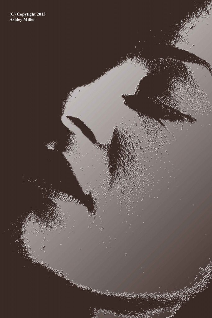
As I have said before you can overdo photoshop. When I first discovered the tools and techniques I went overboard; and over the top. So I stopped and reconsidered and realised that often and image only needed a little tweak. Yet there are some images where it is fun to explore. I like this variant of the previous image; hope you do to.
I feel another theme coming on
Ok so it started as a bit of a joke. After all; I rarely take pictures of people, and when I do they rarely please me and are often beset by technical problems. When challenged to try more portraits my long suffering son (he has hung around icy lakes whilst I happily clicked away, hovered patiently by my side underwater whilst I got out of focus photos of a fish’s bottom) agreed to let me try some shots on him, and my camera refused to focus. So landscape is my thing, water in particular, and any photoimaginator needs to think about what really is important to them … and then sometimes forget about it and try something different. So a small series of photos from my one and only (so far) studio shoot, but doing it my way, foregoing the brightly lit cute shots and looking for those contrasts and textures.
A beautiful model 2
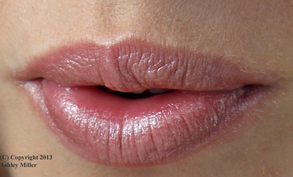
OK; a little tongue in cheek. As you may just have noticed nearly all my images are, or are based upon, landscapes. But just to try something different a local camera club was running a studio session with a couple of models. They were pretty girls and most of the photographers were doing full length shots, with strong studio lighting. Me being me, after a while, I found my close up shots, often taken in natural lighting, even though this created strong shadows, much more interesting. This is a crop from one of the close up shots.